The first two screen shots which I have used are close-ups of the guitar and amplifier. I have used these shots because at the start of the song which i have used for my music video there is an instrumental and I thought these camera shots went best with the music and to set the scene of a live band. Also because they are close-ups they don't give to much away, so the audience will have to keep watching to find out more.

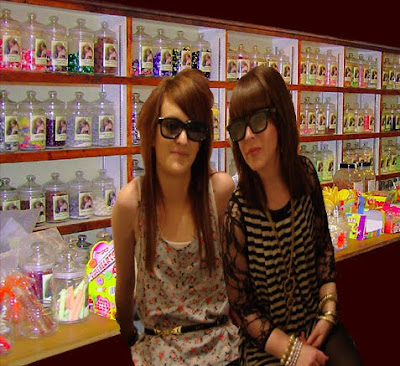
 The third screen shot is of two females playing electric guitars this is a long shot to show their location which is in a room of a house. Also from this camera shot the audience are able to see the females clothes and style so they can relate with the young females in the video.

The fourth and fifth screen shots are mid-shots of the two main characters who are playing The Veronicas sisters in my music video. As soon as the audio starts a camera shot appears of the characters playing The Veronicas showing them dancing towards the camera to show that they are the main focus of the music video. Throughout the music video I have used mainly mid-shots to show the close relationship between the two characters that are portraying The Veronicas. Whenever they appear on camera they are always stood close together dancing, smiling and making eye contact with each other to create and show a close relationship between them.


The sixth screen shot is of the main characters pointing at the camera this creates the effect that they are pointing at the audience to make them involved in the music video. Every time the lyrics say 'With You' in the song for my music video I have got the main artists pointing at the camera to make the audience feel that the artist are singing towards them because the song is about them. This is a close-up shot of there faces so the audience are able to see their facial expressions and their emotions.
 The seventh screen shot is a mid-shot of the five girls sat on the sofa together. This shot is creating a relationship of friendship between them. The girls look like they are having fun together, laughing and enjoying each other company this creates a good atmosphere which make the music video feel exciting.

The eighth screen shot which is a mid-shot shows the man artists playing electric guitars. this is a good use of prop as it makes the artist loo like they can actually play the guitars to their own music. This helps interest the audience and influences them to believing that they really can play guitars like rock stars.


The tenth and eleventh screen shots are to show the types of video transitions that I have used within my music video. I have used these transitions when the camera shot changes to make the shot change look more smoother and so the camera shot flows instead of the shot jumping from one to the next. I have used two different types of transitions within my music video I think it makes the music video look more effective and interesting for the audience.


The twelfth screen shot I have used is a mid-shot of the main artists jumping of the sofa to create a fun and exciting atmoshpere. I have slowed down this shot in my music video to make the shot last longer and to fit in time with the music. This shot portrays the main artists to have a rebellious attitude.

The thirteenth screen shot is of neon coloured lights. To create this I used coloured glow sticks which I have filmed and zoomed in on the shot to make it fill the screen. I filmed this in a dark room and waved the glow sticks in front of the camera. When editing this shot to be used in my music video I adjusted the shot length to make the shot appear much quicker so the shot looks more dramatic.
The fourteenth screen shot is a mid-shot of one of the main artists playing a guitar solo. She is the main focus so this creates the audience to believe that she is able to play the guitar.
The fifteenth screen shot is a mid-shot which shows the girls having fun at the house party dancing to their song. This keeps the relationship of friendship alive and noticeable throughout the music video. The actors create an exciting and happy atmosphere which I shown though the girls having fun with each other.

The sixteenth and seventeenth screen shot is a mid-shot of the girls having a pillow fight which creates the atmosphere of rebellious behaviour and they are having fun together as friends.


The nineteenth screen shot is the final camera shot in my music video, it is a close-up shot of the red light moving across the screen from right to left till the music fades out to show the end of the video.

My first print product which I have created using Photoshop is a DVD cover for the release of The Veronicas Live Tour on to DVD. I am very pleased with my final DVD cover I think it looks very professional and appeals to my target audience. The black and white squared background makes the DVD standout and attracts the audience’s attention. The use of the bright pink text creates a feminine look to the DVD cover which helps attracts the female target audience. I have used large images of The Veronicas so the audience can relate with them and they will know that the DVD is about The Veronicas from looking at the images as well as reading the text. I have used a barcode on the back of the DVD so it is able to be sold in shops. There is an age rating of PG on the DVD cover so the audience know that the content of the DVD is suitable for young children. I have written a short paragraph on the back of the DVD explaining about the content of the DVD to interest and sell the DVD to the audience. I have included special features on the back of the DVD to interest the audience. All of the different features that I have used to create my DVD cover I have found from my research into print products. When researching different DVD covers I found many features that where included on every DVD cover in a similar position for example the barcode, the age rating certificate, the DVD logo and many other company logos that helped to funded the DVD. This is why I have positioned my logos in this way.

My second print product that I have created using Photoshop, is a magazine advert for the release of my DVD. I used the front cover of my DVD for my magazine advert, I did this because from researching into print products I found that magazine adverts always show the front cover of the DVD. I chose to have my DVD cover fill the whole page of the magazine advert this is to make it more dramatic and standout to the audience. I used the front cover of my DVD because this took less time compared with creating a new magazine advert. I added text to the magazine advert such as a quote from a popular female fashion magazine ‘More’ which The Veronicas have appeared in, this was to interest the audience and make them believe that it was a perfect girl’s night in. I used the Amazon logo to show the audience that the DVD was also available to be downloaded, so they did not have to leave the comfort of their own home to miss a chance of buying the DVD. I included the release date of the DVD to the shops so the audience knew when the DVD was available to buy.

This is my inside cover of my DVD. I created this using Photoshop. I think the final image looks very effective and attracts the audience attention. I felt that the final image was strong and attracted the audiences attention. I have included the name of the artist The Veronicas sereal times across the cover to show the DVD is about them. Whilst researching into print products I found that in the inside of a DVD or CD case there was very little if any text, this is why I have chose to use a small amount of text. Most of the print products I researched had a colour background inside the cover which matched the colour scheme and theme to the print product. I wanted to create a strong, bold image of The Veronicas to make the Inside cover look as attractive and standout just like I achieved for the outside cover.

My fourth print product is my DVD disk, I created this using Photoshop. I used a leopard print background to make the DVD very eye catching and standout to the audience. The backgrounds of my DVD disk makes the DVD look stylish, attractive and wild which contributes to The Veronicas sister style. I used this bold background for my DVD disk to keep the same theme for the rest of my print products which was to standout and catch the audience attention. I have used bright pink text and created a white glow around the edge of the text to make The Veronicas name standout and the title of the DVD Live Experience to be readable on the dark busy background. I have included three logos on my disk because from my research I found that on most DVDs they all have official logos so the audience will trust the product. There is a list of the tracks that will be included in the DVD in white text so the audience can see the order of the tracks. The white text is difficult to read, if I was to revisit this I would change the colour of this text to make it easier to read. At the bottom of the disk is The Veronicas official website this is so the audience can visit their website to find out any more information about the artists, I would change the colour of this text to make it easier for the audience to read.
RESEARCH
I stated by choosing the particular brief that I was most interested in which was to create a promotion package for the release of an album, to include a music promo video, together with a cover for its release on DVD and a magazine advert for the DVD. I began my research for my music video I found very difficult to start with because I couldn’t decide which song or band to create a music video for. I started my research by analysing and evaluating different Pop music videos as I knew this was the genre of music I would be working with. From evaluating different Pop music videos I could tell that the camera angles and shots main focus was on the band or the artist throughout most of the music video. The music video did not always tell a story but the music video was base around a scene of events that was relevant to the lyrics in the song. They had a range of different locations and many different camera angles. I created a mind map with all the relevant things and events that are included in a Pop-Rock music video to help inspire me to create a music video in a Pop-Rock style. I also analysed and evaluated print products in detail such as album covers, magazine adverts and DVD covers. I found this research very useful when I began creating my own print products as I could see the layout and use of images and text was included in these different types of print products to promote the artist or band. I feel that I should have created more research into Pop music video and print products as I feel I would have benefited from more research because it would have given me a clearer understanding of what I needed to include within my music video. I researched into The Veronicas sister background so I would have a better knowledge and understanding of where they originated from and how The Veronicas started out in the music industry. I found this part of my research very interesting because I got to learn about The Veronicas style of music genre which is Electro-Pop Rock, their old life style and their musical background. I also made research into my target audience for my music video and my print products. I came to the conclusion that my print products will be given an age rating of PG. I chose this rating because The Veronicas fan base start from a young age of females. A PG rating means my DVD can not contain any grown up topics or themes such as crime, racism, bullying or violence, any bad language, nudity, sex and relationships, dangerous behaviour, weapons, horror, drugs and discrimination.
PLANNING
In preparation to beginning planning for my music video I created my print products which I am very pleased with the finished look that I have achieved. I feel they reach my target audience and are very attractive and exciting to look at. I started by creating a sketch of an idea of what I wanted my print products to look like. Then I built up different layers of images and text in Photoshop until I was pleased with the final product. My research into print products came in very useful when I started to create my own print products because from my research I had a better understanding and knowledge of what I needed to include such as the layout, images and text that are used in the different types of print products. When I began planning for my music video I made a list of the props actors and costumes that I would use when filming my music video. I found this list very useful when I began filming for my video because I had a good idea of what I wanted my actors to wear in my music video and the props that I would need to be included in my music video. I had an unfortunate problem when it came to borrowing a drum set as a prop for my video as I was unable to take it to the location where I filmed for my music video. I felt a drum set was needed because it is a crucial prop in a Pop-Rock music video but I had to go without it. I created a rough sketch of a story board with a few ideas of camera shots and angles that I wanted to create for my music video. I didn’t plan my story board in great detail so I didn’t find it very useful when I came to filming my footage for my music video. Overall I think my planning process wasn’t very useful because I didn’t us my time wisely. I didn’t put enough time, preparation and effort into planning for my music video as I would have liked to. If I was to create a music video again I would make sure I spent much more time planning the different aspects of a music video such as a suitable location, camera angles and shots, lighting, costume and props, I feel these are very valuable in contributing to a music video to set the scene and create the right mood and atmosphere. Due to my poor planning and preparation skills for my music video I feel this is what has limited me to not creating a Pop-Rock music video to my best ability.
My strengths throughout this project would be my print products, I feel I created some very professional looking print products which really appeal to my target audience. This was my first time at using Photoshop I found it very confusing and difficult to use, but once I had mastered how to use it I found it very interesting and I enjoyed creating my print products. Another one of my strengths was my research into print products I found this research very useful when I stated to create my own print products. From my research I was able to see what text and images were used to promote the item, the different types of logos and position they were placed on the item and any other information that was needed to be included on a DVD cover, DVD disk and a magazine advert.
My weaknesses throughout this project would be my time keeping. I found it very difficult to keep to deadlines, editing the music video took me longer than I had planned. I had a lot of film footage but not all of my footage was useful, I found myself repeating camera shot within my music video. Due to my poor time keeping I was unable to film more footage for my music video, as I didn’t have enough time to film any footage then edit it and finally add it to my music video because the whole process is very time consuming. Another of my weaknesses is that I don’t have much experience and knowledge with using the MAC computers. This wasn’t very useful when I started to edit my music video as it took me a while to remember how to use the basic tools on Final Cut. Working by myself to complete this project was at weakness at times because I was limited to creative and unique ideas that I could use for my music video. Working by myself meant I had to complete all the research and planning for my music video whereas if I worked within a group I could of shared the work with my group members, this would have made this stage of my project much less time consuming and more interesting because I would have more than my own opinion on ideas and plans for my music video. I had to adapt my print products and make changes to my final print products because I wasn't able to use the offical images of The Veronicas sister which i had downloaded from the internet I had to make sure everything was my own work. I had to create new images using the actors that appeared in my music video to protray The Veronicas sisters. I had very little time to create new images and edit and manipulate them which I think was shown in my new print products because the images could have been much better quality.
AUDIENCE FEEDBACK
The audience feedback that I received from my media class has been a mixture of both positive and negative comment towards my music video. I feel that all feedback either positive or negative is useful because if I was able to revisit my music video and make changes to improve it my peers comments and suggestions would help me to work on the areas of my video that needed to be improved. My media class is a mixture of different types of social groups, so they are not my direct target audience for my genre and style of my music video. They all have their own opinion about what they think works and what they don’t like, so by listening to their comments and suggestions I have a clearer understanding of what areas I would need to improve in the future.
Here are some examples of the positive feedback I received from my media class:
“Good use of speeding up and slowing down film footage, adds interest to the video.”
“I liked the jump in the air which you have slowed down makes it look very effective, goes with the music.”
“Fun exciting atmosphere is consistent throughout the music video.”
“The camera shot at the end of the music video looks very effective, where the red light moves across the bottom of the screen.”
“I liked the use of the transitions that you have used in your music video. They made the camera look like it zoomed in one shot and then appears zooming out of a different shot.”
Here are some examples of the negative feedback that I received from my media class:
“Not much use of different camera angles, most camera shots where mid-shots.”
“Didn’t use a variety of locations, which made the video less interesting.”
“Repeated camera shots throughout the music video so there is a lack of new film footage”
“Not much footage of the band and instruments considering it is a Pop-rock video”
From my audience feedback I have received both positive and negative comments which if I were to revisit my music video in the future I would find these comments very useful in helping me to improve my work to a higher standard.
Over all I am very pleased with how well I coped working by myself to create my music video and coursework. Working by myself made discussion making very easy, I didn’t have to worry about anyone else not turning up to lesson or not being able to make time to film or doing their share of the work but there was a lot of weaknesses of choosing to working by myself. By making the decision to work alone I was limited to creative and unique ideas for a music video. Also I had to complete all the research and planning myself whereas if I worked within a group I would have been able to share out the work between the group members, this would have made the research and planning stage much quicker. My research in to print products I found really useful when I began creating my own print products. From my research I was able to know what was needed to be included on the print products such as the logos, text and images that were used. The stage I most enjoyed within this project was creating the print products, I feel that I achieve my best at creating ideas for my print products and finishing them to my highest ability. Planning for my music video was my downfall because I was not well organised. I found it very hard to arrange a suitable time when I could film my footage for my music video due to my friends having work, college and other commitments. My poor effort at planning showed when I started editing my footage for my music video. If I had more time for this project I would have create a better music video with a variety of different locations and camera angles. A variety of locations and camera angles is what my music video lacked this would make it more interesting for the audience, throughout my music video I mostly used mid-shots because I didn’t plan my camera angles well enough. I wanted to create an exciting and fun atmosphere which would be shown throughout my music video which I feel I did achieve. I created relationships between the characters in my music video so the audience could tell that the girls in the video are all friends having a fun and exciting time together this was shown through the camera shot of them smiling and dancing close together.
 This is my new inside DVD cover. I have added new text to the background 'The Veronicas' so the audience are able to identify the inside of the DVD with the artist. I have used a feminine colour scheme of different shades of pinks and purple colours. I have added an effect to the original image to create a blurry paint effect to the image. I am pleased with my new inside DVD cover considering the time I had to create a new idea I think it looks very effective.